The Nothing OS is one the best clean, minimalist, and innovative OS on the market, But when it comes to volume control, there need for improvements.
Although the current design On OS 2.6 is so good, the sound control is not user-friendly, in my personal experience.
Now already Nothing rolled out the Nothing OS 3.0 Beta volume control is the same design.
To improve this aspect of user interaction and experience, a Nothing Community member, Arkadiusz, shared his Nothing OS Volume Control Concepts– and those concepts look very innovative.
While he says he is not a professional UI designer, he was unhappy with the current version of design like me.
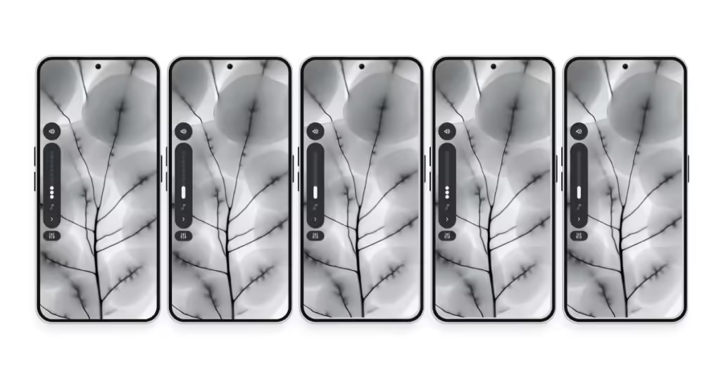
He shares 5 concept designs for volume control which look very interactive, unique, and innovative based on the Nothing Signature Design Style.
Let’s check all of them One By one…
Note: These are the concept designs, but that doesn’t mean they come with the next OS updates.
Here, Nothing OS Volume Control Concept Design
Concept 1- Nothing Dotted Volume Control Design For Nothing OS

The Concept 1 design is very simple, he keeps it aligned with the Nothing Doted signature designs.
This Nothing OS volume control design has followed a minimalistic, clean, and simple style.
He keeps the original design OS the OS 2.6, only removing the live caption button and adding the volume control icons.
Where the white dots show the sound levels and the flat icon speaker and setting match the monochromatic colors theme, which delivers the Nothing transparency and simplicity.
Concept 2- 2.6-Esque (mix Of Dotted and Standard)
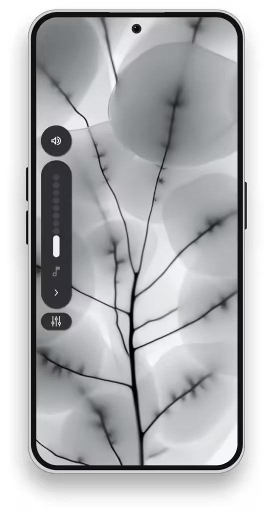
Concept 2 keeps the design elements of Nothing OS 2.6 but with minor improvements like removing the lives caption button and adding the volume control icon like Concept 1.
It has the same Flat and Monochromatic Icons which reduces the visual clutter and makes it simple.
Concept 3- Simple Volume UI No Dotted

On the Concept 3 designs, Arkadiusz has removed all the dotted designs and kept it simple flat bar design of the volume slider, which makes the UI feel smoother and cleaner look.
Also, most of the Nothing Fan of the community users love concept 3, it looks as simple as all the before design concepts and OS 2.6.
This design keeps both concepts removing the live icon and adding the control icon.
Concept 4-Blend the Dotted and Normal design

The concept 4, Arkadicusz blended both concepts 2 and 3, to make it unique and stand out from other concepts.
This means, that it followed the monochromatic color theme, revoked the live icon, and added the control icon, additionally, he added the dotted bar as the volume indication on the volume slider, and the slider’s design is simple.
Concept 5-A Darker Line Volume Control
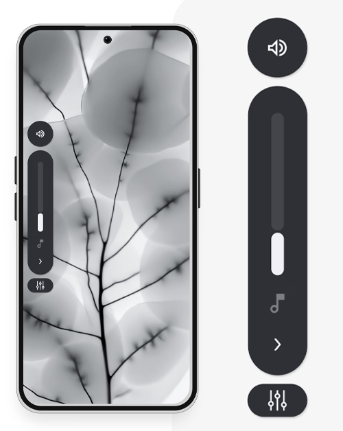
The fifth concept is very unique from the other concepts, where others have dotted fonts, it follows the standard simple flat slide and volume indicators but adds a divider to indicate the volume levels.
You can’t identify the design and the indication as he says it is difficult to identify, but if you zoom the image and looking the control you will see the divider, a darker line divides the volume indicator, and the volume slides.
I love this one design which feels simple as well as futuristic design, and it perfectly fits with the Nothing Designes.
Extended view Concept: Control Center For All Volume Setting

Look at the extended view concept, it is much more unique and an enhanced concept of the Nothing OS 3.0.
It had two designs one is a simpler standard and another is dotted theme-based, I like the simple one, also most out of the community use it like this simple one.
When you click on the right arrow, the sound setting will be expanded and show all the sound settings like sound, vibrate, silent, and additionally, he added the DND (Do Not Disturb) icon.
At the top of the panel, the icons are well designed when you click on the icon any one of them the selected icon will be highlighted with circular on the flat design and dotted circle highlights for the dotted theme designed.
This shows how it is well designed for the line with the Nothing Eco-systems.
DND Mode on the Expand Volume Control Center

Nothing CEO, Carl Pei already said that all the Nothing Phones are designed for less phone use so they designed the Nothing icon pack.
Because of this one reason First time I switched from the Redmi Note 8 Pro to a Nothing Phone (2a), there was one problem, every time I needed to activate the DND, I went to the quick setting panel to enable it.
So I redesigned this like, now you can easily access the DND with one button click could help disconnect the Volume control setting as well as access the DND slider, which helps to optimize the workflow.
Volume Control Independently By Each App
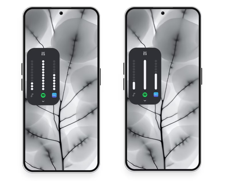
With this design concept, you can easily control all your streaming app audio settings.
It integrated the Android OEMs, which is a “Sound assistant”, that helps you to control separate audio stream app volume independently, which is very good a big thank you to him.
Add the currently playing song art on the control center
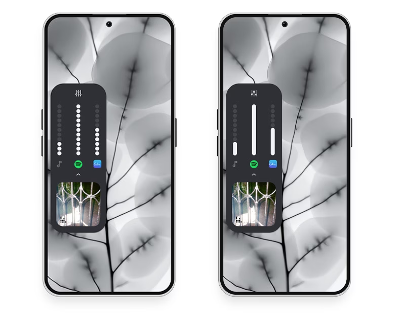
Additionally, Arkadiusz added the Spotify logo which will allow you to see the currently playing song, for easy control.
The Arkadiusz design is not only one concept that adds this concept feature but also there is another community member Rahul Janardhanan made the same concept with different layouts, which is a very innovative Volume control in Nothing OS.
Look at this…
I think I love this one more than the Arkadiusz concept.
Conclusion: Nothing Phone volume Control Improvements
Thanks to Nothing, allows the Fans, can build the concept design and share it with them, and they will review it if they love they can use that one.
How cool, your concept design will be available on the global market with Nothing Phones.
The Arkadiusz design is so good and is an aesthetically fit on the Nothing eco-system, I should recommend that the Nothing Team look at this concept and approach it.
If you are truly a Nothing Fan, share this concept on social media and tag it with @nothing- who knows your favorite design might just make it into the next Nothing OS updates.
