Now Time to come up with Nothing OS 3.0 based on the stable Android 15. The Brands that have been planned for this OS 3.0 will be coming out with the Nothing Phone (3).
Carl Pei, the CEO & face of the Nothing Brand, has just teased and updated about the Nothing OS 3.0 Leaked images, on her official Personal X accounts.
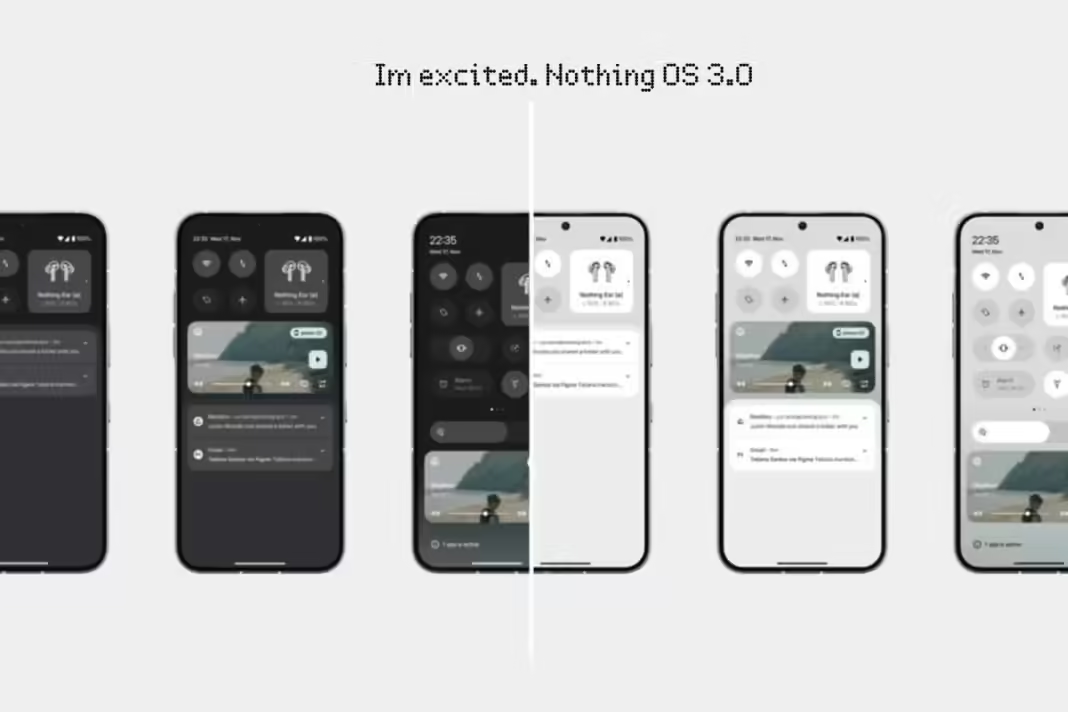
The X post included the new OS 3.0 interface design images showcasing the company’s vision, simplicity, new UI, and functionality.
Also, the CEO asked Nothing Fans to give feedback on this design so that they can improve their Nothing OS 3.0. We will discuss what the fans share their opinions about the design and feedback.
The Release Date Nothing OS 3.0?
As per Carl Pei, Nothing OS 3.0 will be coming up this September 2024, but the brand still needs to confirm which date it is.
But as up now Aug, they have launched 3 smartphones in 2024, Also they have no other updates about the OS 3.0. I think they have planned to roll out the Nothing OS 3.0 beta version with Phone 2, Phone (2a), and Phone (2a) Plus in September 2024.
The leaked Images of Nothing OS 3.0
Nothing OS 3.0: Design Highlights
From the revealed shared design, the CEO shared both dark and light mode images, also on Reddit has has shared an image of the Lock screen customization of OS 3.0.
If you look carefully, the design features both light and dark modes, it focuses on the easy-to-access setting UI of the quick setting menu. The setting panel has been refined from the Nothing OS 2.0, with larger, rounded icons, which ensures the user can access the key function with minimal effort.
Also, the Notification panel has been improved with a cleaning and more organized layouts.
Just look at the Dark mode design, it is a more soft, natural palette, with soft light colors on the eyes, which means it has modern visual and enhanced looks.
What are the user Reactions and Feedback?
The design has sparked a wave of responses on X by Nothing Community Users, where some users are looking at the design and some are giving some feedback to change on few UI.
Here is a look at what the fans are told.
- @MinimalistManiac: “This is exactly what a UI should be on the Android – simple, elegant, and easy to navigate.”
- @DarkModeFanatic: “The Nothing OS 3.0 new dark mode looks fantastic! It’s sleek and perfect for late-night use.”
- @UIEnthusiast: “Loving the new design direction. It’s clean, functional, and doesn’t overwhelm with unnecessary elements.”
- @punitsingh176: The slide of the silent, vibrate and the Gemeral mode look very good.
And much more love with 537.1K Views and 7.8k Likes.
Here are some user demands for changes to the UI.
@Chaitanya7483: gives feedback that brightness adjustment moves to the upper section
@punitsingh176: suggests Making this slideable from left to right instead of up and down.
@Technerd_9: share the images to get Channing on UI with some modifications.
@SamuraiTronVC: Give Suugetion on equal padding to sides. Day & 🔋% text
@heysuhith: Suggest to remove the extra space on the Top.
What My Opinion On Nothing Os 3.0
Already the Nothing OS set a standard for Smartphone OS. From the upcoming Nothng OS 3.0, set a higher expectation with features of functionality, UI-UX, Minimalism, and customizations.
But let us see on the upcoming dates, if the brand meets the expectations of true fans.
