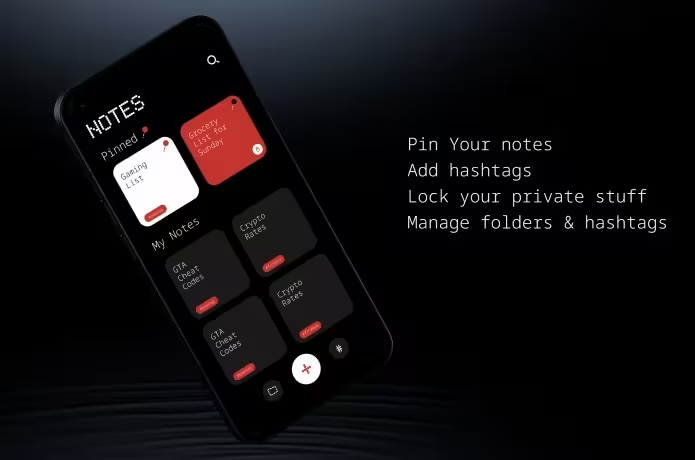
The software team behind the Nothing brand continues to push the boundaries of innovative design and minimalism, this time Nothing has focused on their first-party app, Nothing Notes App.
Like other brands Samsung, Apple, and Oneplus, it has already built its brand identity through stunning first-party apps. Nothing trying the same thing.
In this article, we will take a closer look at the Nothing Phone Notes App, its design elements, and the team’s recent discussion about improving the app before it’s launched on the Google Play Store.

Nothing Focus on Building First-Party Apps
Already Nothing has focused on the first-party app, The Nothing Gallery, an AI-integrated app, which comes with the Nothing OS 3.0. The Nothing Notes is set to follow the same brand identity, and signature clean, intuitive, and minimalistic design.
We already discuss the Nothing OS 3.0 features, check out that one.
The Nothing teams have been heard at works for developing this new app, and their recent discussion offered deep insights into what you can expect.
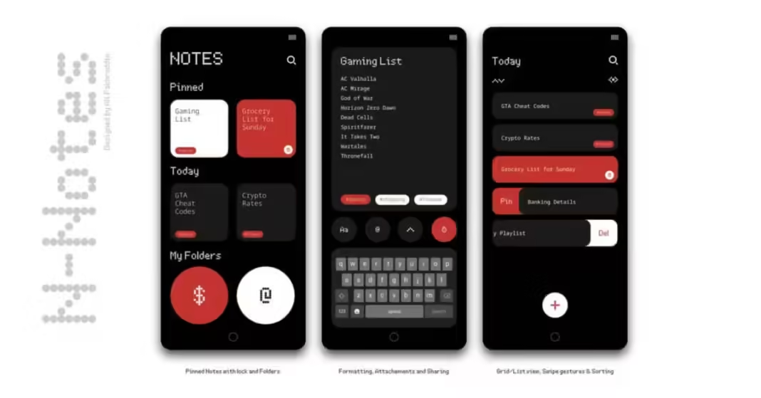
In a recent YouTube video discussion from the Nothing team, all the Nothing Software team has reacted to their fan-design concept on the first-part app including teh Nothing Note App designed by Ali Fakhruddin.
The team has discussed the key design element choice, colors, typography, and navigation that aim to enhance the overall Nothing Notes user experience, which aliens the Nothing Brand identity.
Let’s take a closer look at all the key takeaways they have discussed…
Minimalistic Branding: Reducing the Use of N-Dots Fonts
From the discussion, the main theme is maintaining the Nothing Brands identity without overlaying the N-dot fonts.
However the the N-dot is the key design element of the Nothing theme branding.
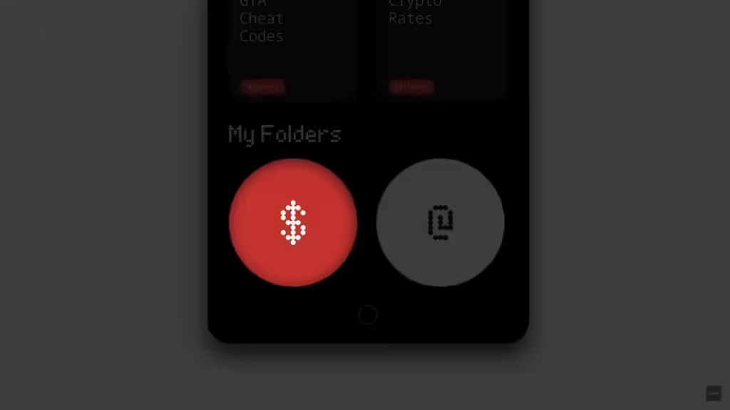
Just look at the design of the Nothing Notes, the Dot font on the top of the Nothing Logo, the category name, and the Butoom folder list logo, which clarifies the Nothing Brands, which may little bit bit of overcoming.

So the Nothing software team has suggested that the Ali Fakhruddin design reduce the dot fonts on the folder cover.
This approach maintains the minimalist aesthetics without losing the Nothing brand recognition.
Consistency in User Experience: Enhance Nothing Phone Notes App Navigation
Another key focus point from the discussion was improving the navigation UI, theme, and style for a more consistent user experience.
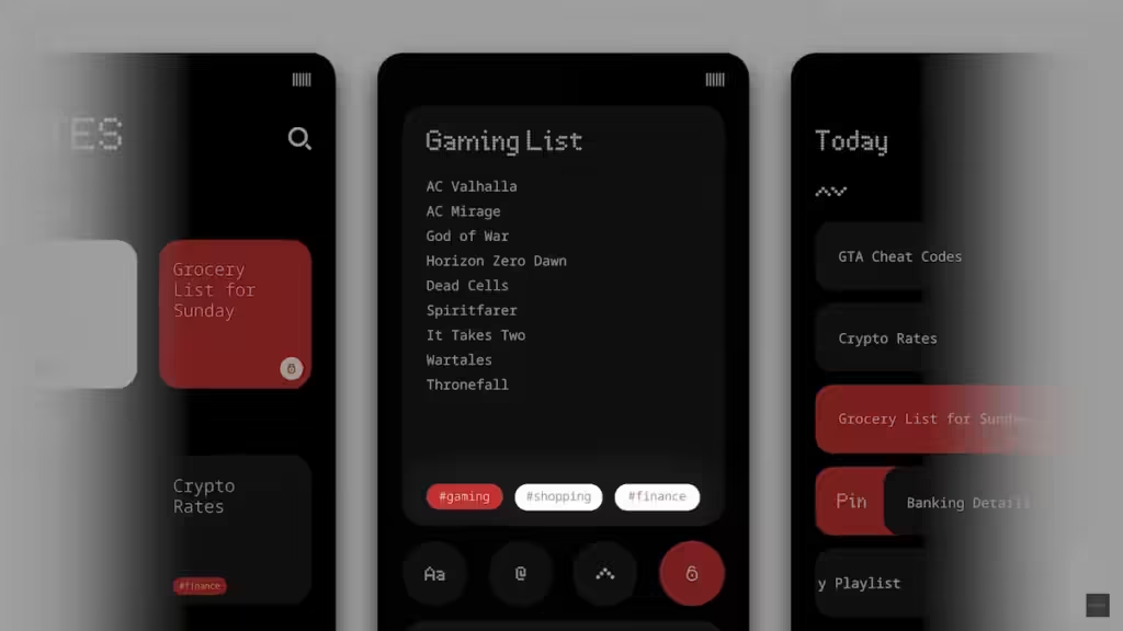
The original design by Ali Fakhruddin displayed a lack of inconsistency in design, especially when moving between sections such as Notes, Gaming List, and Today, as you see in the images.

The team pointed out that the subtle difference in the current design might be confusing to Nothing users and may feel less polished.
Another suggestion for refinement of the design is the Easy way to return to the previous screen. While a user is editing the note there is no clear navigation path to go back to the previous design across the different parts of the Note app.
The suggestion is to improve the user experience and feel attractive, engaging, and well-designed.
Typography: Moving Beyond the Monospace Fonts

The use of monospace fonts in the Nothing Note app came under critical observation.
The monospace font space is good for suitable for certain purposes like the tags and level of the Notes, but this is not the best for long-form content or text.
While reading the large notes feels overwhelming, the team suggested using monospace fonts selectively- for short note tags, and labels- while experimenting with fonts on the long-form content text, which significantly improves the usability.
Colors Accents: Striking a Balance with Red Color

The team also touched on the colors that are used in the Nothing Note App, particularly the red accent color in the app.
White the red color grabs the attention, at the same time it offers an impression of danger or urgency, which can distract users or create unintended emotional responses while using too much on design UI.
The team suggests the designer should pay attention and aim to balance the color palette of the Note UI while using the red accent and maintaining the user psychology for an emotional response.
Extending the Nothing Design Language to First-Party Nothing Notes Apps
One of the most exciting aspects of the discussion was how the Nothing Notes APK design brings the Nothing Design unique design language to the Home screen.
The app edit icon on the Nothing Note App echoes the looks and feels of the home screen while keeping things visually consistent across the Nothing eco-system.
While this Nothing Note design touches might need tweaking for certain functions, it is great to see the team rethinking how the Nothing Unique design can evolve beyond just the home screen.

Final Thought Of Nothing Notes App
The Nothing Note app showcases a great way to approach the Nothing Users, to keep their notes modern and use the app very user-friendly, while maintaining simplicity, consistency, and a smooth user experience.
Although the the Nothing team has not yet approved the design, some designs might be thoughtful and need refinement by the Nothing software team such as visual symbols like N-dots, refining navigation, improving typography, and using color.
Excited about the Nothing Notes app? Share your thoughts in the comments below!

However, the is now Nothing focused and its first-part app, and possibly the app will come with the upcoming Nothing Phone (3), which may be they integrate teh AI features of the Note like the Google Keep Note App.
Until then, Nothing fans eagerly await the release of the Nothing Note App on the Play Store.
